Brand Britain Evolved
Featuring Martin Parr, Protect, Burberry, Ffern and Jim Legxacy.

For decades, the idea of British identity, and the brands that expressed it, was largely fixed and predictable: defined by tradition, hierarchy and well-worn symbols of national pride. Today, that is no longer the case. A new wave of creators and companies are reshaping what it means to be British, blending heritage with experimentation, wit and a willingness to embrace contradiction.
From the observational photography of Martin Parr to the ritualised, seasonal fragrances of Ffern, the streetwise ingenuity of Protect, the genre-defying music of Jim Legxacy, and Burberry’s reinvention of classic codes under Joshua Schulman and Daniel Lee, contemporary Brand Britain is more plural, fluid and self-aware than ever before.
As we previously covered in The New Soft Boys with Corbin Shaw, these makers and brands reinterpret familiar symbols – Union Jacks, trench coats, village fetes, even the simple act of wearing a reversible jacket – and infuse them with new meaning, often playful, sometimes subversive, always culturally literate. They demonstrate that Britishness is no longer a static heritage to be preserved, but a living narrative shaped by creativity, identity and social context. To connect with audiences today, Brand Britain must be dynamic, nuanced and willing to surprise.
Martin Parr
No one taught Britain how to look at itself quite like Martin Parr. The late Surrey-born photographer didn’t just document British life; he reframed it, turning leisure, awkwardness and bad taste into something confrontational, funny and quietly radical. His images made icons out of ordinary people and revealed a nation obsessed with class, ritual and self-performance. Long before “authenticity” became a branding buzzword, Parr was interrogating who Britain really was – and who it was pretending to be.
Class and patriotism sit at the centre of Parr’s gaze. His highly saturated, hard-flash photographs of Young Conservative conferences, village fêtes and St George’s Day parades don’t mock Britain so much as expose it. The humour is sharp but never lazy, often tucked into the corner of the frame, forcing the viewer to confront the contradictions of national identity: pride and embarrassment, tradition and decay. Parr’s Britain is recognisable, but never comfortable.
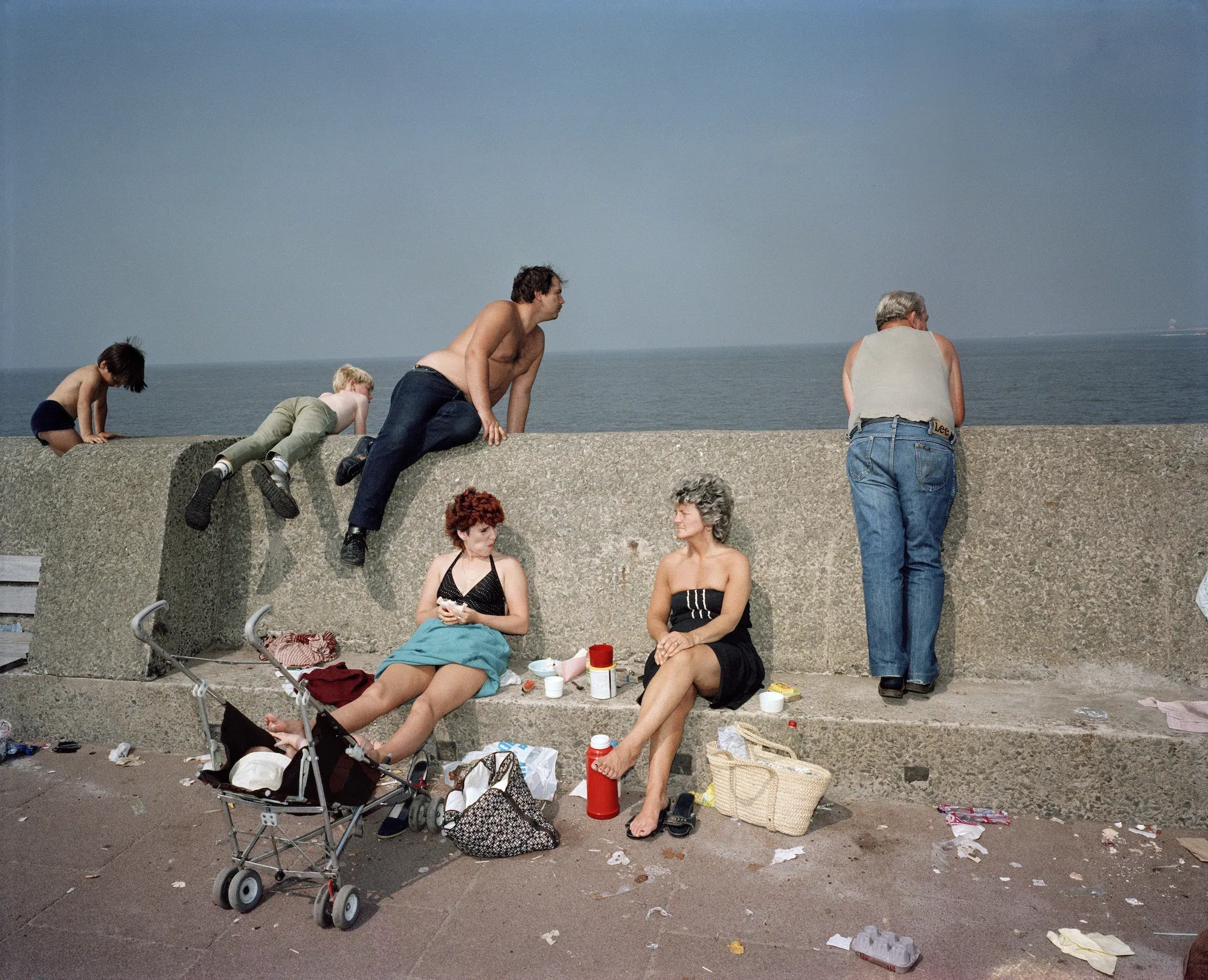
This sensibility crystallised in The Last Resort (1983–85), Parr’s defining series shot on the beaches of New Brighton, Liverpool. Against the backdrop of economic and emotional strain, sunburnt bodies, littered sand and cheap pleasures revealed both the toughness and tenderness of the nation. As Parr put it, “You can read a lot about a country by looking at its beaches” – a reminder that the most revealing brand truths often emerge in shared, unfiltered public spaces.
Before Parr, Brand Britain leaned heavily on politeness, pomp and pageantry. He punctured the myth. Even when photographing cucumber sandwiches and village greens, Parr refused to smooth over the uncomfortable edges. His work showed that Britishness didn’t need refinement to be valuable – that awkwardness, excess and contradiction were the point. It’s this unsanitised gaze that makes his photography such a vital cultural record.
Unsurprisingly, Parr’s visual language has been widely borrowed by brands seeking a more knowing, contemporary Britishness. Wolff Olins’ 2025 Lloyds rebrand leaned into Parr-esque cues: candid close-ups of ice creams, umbrellas, pints and fry-ups designed to signal warmth and familiarity without nostalgia. Others have gone straight to the source, with Fortnum & Mason, Gucci, Saint Laurent and Louis Vuitton all collaborating with Parr to express a distinctly British blend of charm and strangeness.
Takeaway: In a moment when Brand Britain is being redefined – less polished, more plural, and far more self-critical – Parr remains essential. Not as an aesthetic shortcut, but as a strategic reminder: the future of British identity doesn’t lie in tidying up its image, but in learning how to sit confidently with its mess.
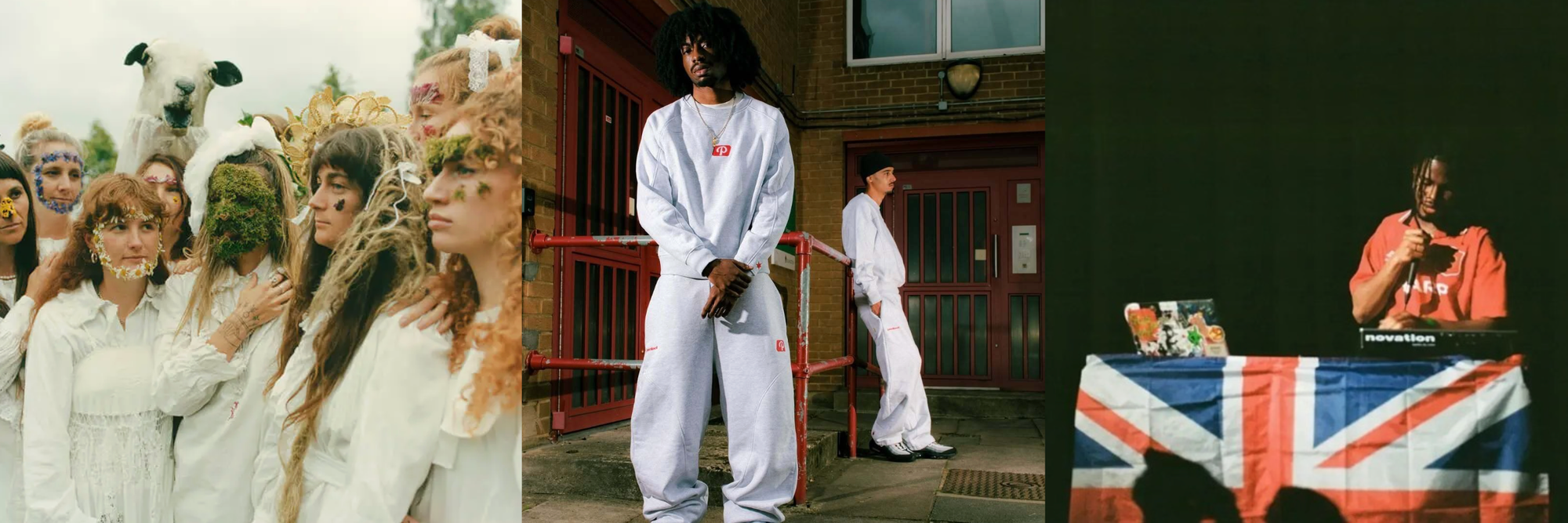
Protect
Protect is a London-based fashion brand, founded in 2022, threading the streetwise energy of early 2010s London with a wry, political edge. Its pieces speak to a generation disillusioned with the usual tropes of Britishness, yet still deeply rooted in place, community and pride.
To launch its Reverso Puffa, Protect released a campaign film showing a young man running in a black puffer jacket. He ducks behind a wall and flips the jacket to its white reverse. When an out-of-breath policeman arrives, he doesn’t recognise him as the suspect. The young man then casually points down the road, blending mischief with street-smart adaptability.
The moment is simple but densely loaded. A sharp comment on surveillance, visibility and identity in contemporary Britain, it turns the reversible jacket into a gesture of street-smart self-preservation. In doing so, Protect transforms functional design into cultural narrative, capturing how adaptability and resilience operate as everyday survival skills for British youth today.
Takeaway: Protect shows how Brand Britain can be rebuilt from the street up. By cheekily subverting negative stereotypes around British youth – suspicion, surveillance, hoodie culture – the brand reframes them as symbols of ingenuity and self-awareness, proving that contemporary British identity is less about respectability and more about resourcefulness.
Burberry
Under new CEO Joshua Schulman and creative director Daniel Lee, Burberry is reawakening the products, symbols and sensibility that made the house globally legible: tartan scarves, trench coats, umbrellas, the equestrian knight. But rather than freezing these codes in heritage amber, the brand is reframing them through a cast of British cultural icons who embody sophistication, eccentricity and humour in equal measure.
Since Schulman’s arrival, that recalibration has delivered tangible results. Burberry’s share price has doubled and, in November, it reported its first quarterly sales increase in nearly two years — with growth fuelled by Gen Z acquisition (up 18%) and renewed traction in China, driven in part by social-first storytelling, according to the Financial Times.
Creatively, Burberry leans into what might be called raw romanticism: nostalgia without stiffness. Recent campaigns star Olivia Colman inhabiting familiar British archetypes — chip shop worker, tour guide, London busker — alongside figures like Amelia Gray Hamlin, Lucky Blue Smith and Tyson Beckford. The contrast sharpens the brand’s wit and cultural specificity, positioning Britishness not as quaint or insular, but as something charismatic, exportable and alive.
This recommitment to clarity extends into retail. Trench coats are displayed in every cut and fabrication; umbrellas and headscarves are deliberately positioned for rain-soaked tourists. Scarves, once sidelined as unfashionable entry items, are now foregrounded through revived “scarf bars”: tactile, customisable spaces where colour, print and monogramming reassert the product’s relevance. It’s an obvious strategy, perhaps — but one grounded in rediscovering what customers actually want from Burberry.
Alongside this, behind-the-scenes YouTube content offers a cinematic view into the making of icons like the trench and scarf, reinforcing British craftsmanship as both process and performance.
Takeaway: Burberry’s revival shows that Brand Britain doesn’t need reinvention so much as re-anchoring. By confidently foregrounding its most recognisable codes – and making them playful, participatory and culturally fluent – the brand proves that national identity becomes powerful again when it’s worn lightly, understood deeply and designed for the present rather than preserved for the past.
Ffern
Ffern is a fragrance brand steeped in the folklore and natural rhythms of the British Isles. Four times a year, it bottles a specific moment in the calendar, releasing a new scent on each solstice and equinox to its ledger of members. It’s a slow-burn model that prioritises intimacy, ritual and seasonal attunement over scale.
Each release is accompanied by short films that articulate the story embedded in the scent – A Tuscan Summer, Snow Dance, Quince Kitchen. For spring 2024’s Ode to Rhubarb, an English male choir performed a bespoke rhubarb song written for the brand: a distinctly British kind of quirk that blends comfort with surprise. This twist on the familiar runs through Ffern’s casting too, from Bill Nighy to Nigella Lawson.
As we explored in The Business of Spirituality, there’s a broader return to the mythic as people search for meaning amid uncertainty. Ffern taps into this shift with spellbinding restraint and a clearly British sensibility.
Ffern elevates the everyday to something almost sacred: wind-fallen apples, seaweed, poppies and snowdrops treated as cultural symbols. It also actively invests in British creativity, championing photographers, florists, musicians and actors, and founding the Ffern Folk Foundation to support a new generation of folk arts and traditions.
Takeaway: In an age of overstimulation, Ffern shows how meaning is built through rhythm, restraint and repeatable ritual. By rooting itself in place, seasonality and cultural myth, the brand proves that modern relevance doesn’t require constant novelty – just a deeper sense of belonging.
Jim Legxacy
Jim Legxacy’s third album, black british music (2025) (BBM), treats British identity as a living collage rather than a fixed lineage. The project moves fluidly across UK rap, drill, afrobeats, emo, garage, jungle, punk and indie, using genre-blend as both method and message. In doing so, Legxacy stakes a confident claim on the Black British music canon, pushing back against the idea that it can be reduced to a single sound or scene.
Themes of home and identity have long defined his work. His sophomore album, homeless n*** pop music* (HNPM), offered fragmented snapshots of growing up in Lewisham in a Nigerian household, grounding experimentation in lived experience rather than abstraction.
Legxacy’s visual language is just as central to his articulation of Britishness. HNPM’s cover features cut-out tower blocks, red buses and road signs, while BBM continues the collage approach with grainy black-and-white imagery, including a figure in a Three Lions bikini. The project nods to early 2010s culture through its abbreviated title and lo-fi aesthetic: the video for aggressive was shot partially on a BlackBerry and spliced with archive footage of Dizzee Rascal and Giggs, positioning Legxacy within a UK rap lineage later reinforced by Dave’s feature on x3.
Like Vivienne Westwood and the Sex Pistols before him, Legxacy recuts the Union Jack and reclaims its meaning. Draped over his head, pinned at live shows or waved in videos, the flag becomes less a symbol of nostalgia and more a declaration – insisting that Black British culture isn’t adjacent to the nation’s identity, but central to it.
Takeaway: Legxacy offers a blueprint for a modern Brand Britain that is plural, remixable and authored from within. By refusing singular definitions of Britishness and confidently reclaiming national symbols, he shows how cultural authority today is built through inclusion, hybridity and the courage to redefine the canon rather than simply inherit it.
| SEED | #8374 |
|---|---|
| DATE | 16.12.25 |
| PLANTED BY | PROTEIN |